
How to implement hover animations for link buttons in Webflow

When a user visiting a website places the mouse on the button, there is simply an animation that moves smoothly, and the overall impression of the site changes drastically. Not only does it intuitively convey “clickable elements,” it also has the effect of showing the politeness and perfection of the brand.
Webflow lets you implement hover animations for links and buttons without writing code. This article explains practical steps, from basic hover effects using style settings to full-scale animations using the Interactions panel.
Why hover animations are needed
Hover animations aren't just decorations; they act as feedback for users. By changing the button when the mouse is over, it provides a visual clue that “this element can be clicked” and reduces operation hesitation. Especially on corporate sites and landing pages, the CTA button hover effect can also affect conversion rates, so it's important to implement it properly.
There are two main ways to implement hover effects in Webflow.
- How to use the style setting “Hover State” — You can set simple changes such as color, shadow, size, etc.
- How to use the Interactions panel — Detailed control over animations with a time axis (fades, slides, rotation, etc.)
[Image] Screenshot of how the “Hover” state is selected on the Webflow designer's Style panel, and a screen where the Canvas button is highlighted in the Hover state
Implement hover effects in style settings
If it is a simple color change or the addition of shadows, it can be implemented using only the Style panel, so it is the most basic and easy-to-maintain method.
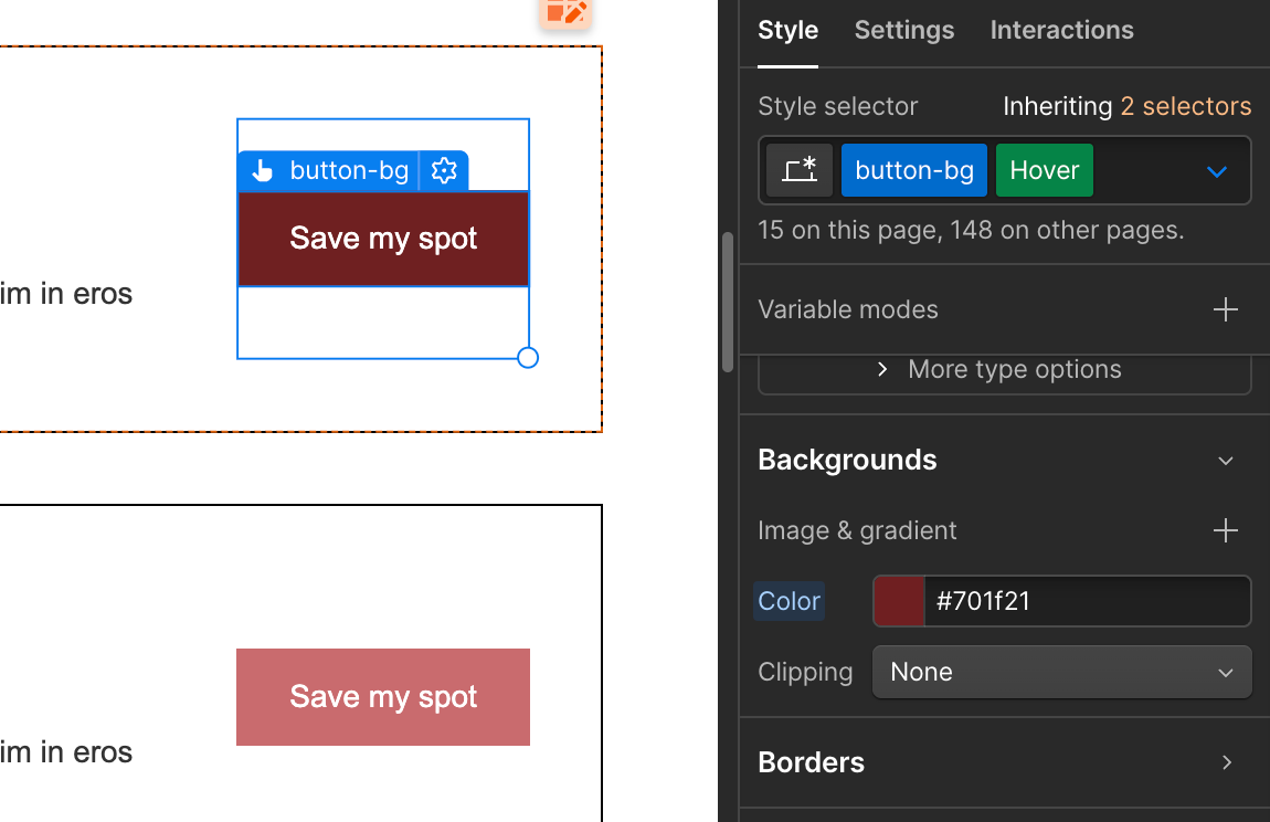
Change the color of the buttons in Hover State
Select the button element in the Webflow designer and switch the state selector (dropdown checked “None”) at the top of the Style panel to “Hover.” When you switch to the Hover state, the Canvas buttons will always be displayed in the hover state, so you can check the changes intuitively.
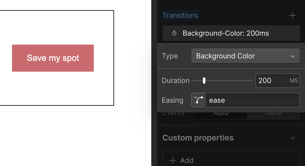
If you change the background color in this state, you can set a hover effect that is displayed in a different color only when the mouse is placed on it. Furthermore, by adding transitions, you can add smooth animations to color changes. You can set it from the “Effects” section of the Style panel.
In Transition, you can specify “Duration” (time required for change) and “Easing” (acceleration/deceleration pattern of change).200-300 ms ease-out combinationThe settings are natural and easy to use.
[Image] Screenshot of a screen where duration and easing are set in the transition section of the style panel
Implement underline animations for text links
The “underline stretches on hover” effect, which is often used for text links, can also be implemented with style settings. In the normal state, it is common to place a pseudo-element (or border) with a width of 0% at the bottom of the text and change the width to 100% in the hover state.
Specific steps are how to set Position in the link text container with Relative and create a Before pseudo-element with custom code, or for underlining<div>There is a way to place elements within a link and change the width with a transition. The latter can be completed with only Webflow's visual operation, so it's also recommended for beginners.
Implement professional animations with the Interactions panel
More complex hover animations — three-dimensional effects where elements float up, movement of icons rotating, effects where multiple elements work together, etc. — are implemented in Webflow's Interactions panel. Note that for advanced effects with scroll animations and time axes,WebFlow's GSAP integration featuresIf you use it, the range of expression will expand even further.
Set the Mouse Over/Mouse Out trigger
With the button element selected, open the Interactions panel (lightning bolt icon) and add a new interaction from the “+” button. If you select “Mouse Over” as the trigger type, you can define the action when the mouse gets on the element. Basically, “Mouse Out” (when the mouse leaves) is also set as a set.
Actions can freely combine element opacity changes, position movement (translateY), scaling (scaling), rotation, etc. For example, to create an effect where the button floats slightly upward, set “Move Y” of Transform to -4px・200ms・ease-out with Mouse Over, and set Move Y to 0px・200ms・ease-in with Mouse Out.
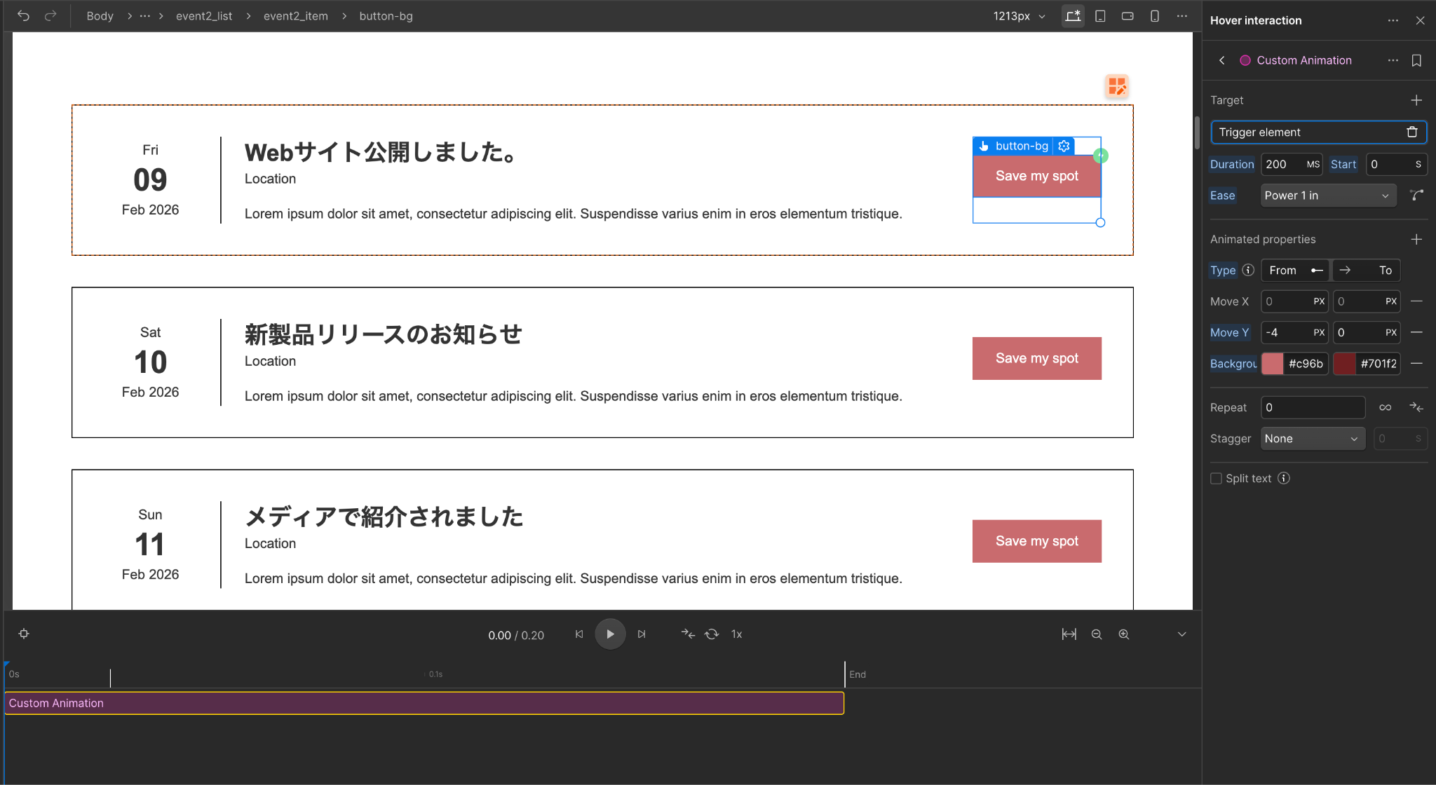
[Image] Screenshot Timeline screen with Mouse Over/Mouse Out triggers and actions set on the Interactions panel
Animation that links multiple elements
Webflow interactions can be set separately for triggering elements and elements that actually animate. For example, it is also possible to configure the entire button as a trigger, and only the icon inside it rotates, or the adjacent text fades in when hovering over the button.
Target elements can be flexibly set by specifying “Children” and “Sibling” in the action's “Attending” option. Even complex animations can be implemented without code knowledge since all Webflow's interaction editors can be operated visually.
Animation design with performance in mind
Heavy use of hover animations can affect site performance. In particular, changes in transform (movement/enlargement/rotation) and opacity (transparency) are lightweight because GPU processing is effective, but changes in properties that affect layout such as width/height/margin/padding increase browser redrawing costs.
The cardinal rule of performance is to use transform and opacity as much as possible when implementing animations, and avoid animating properties that involve layout changes. Also, if you set a large number of WebFlow interactions per page, the amount of JavaScript loading will increase, so be aware of narrowing down and applying them where you really need them. When organizing styles,Style selector for quick review of recently changed classesBy using, you can efficiently grasp which classes contain hover settings.

[Image] Screenshot Preview screen of the completed button hover animation (confirmation state in the designer's Preview mode)
summary
There are a wide range of ways to implement hover animations in Webflow, from simple transition settings in the Style panel to multi-step animations using the Interactions panel. The order of first testing with color changes and transitions in the Style panel, then challenging the Interactions panel when more expressive effects are needed is smooth. If you want to easily incorporate text animations,How to use GSAP for free with WebflowPlease also refer to it. Appropriate hover animations enhance the user experience and enhance the overall completeness of the site. Please take advantage of Webflow's strengths, where you can do all this without code.
Booost is a web development service specializing in the no-code tool "Webflow."
We maximize your website's customer acquisition power through three optimizations: design, marketing, and translation.

